The Pattern Project – Concept
Point of departure was my interest in the question: What could a cool contemporary re-interpretation of medieval initials look like? I didn´t have the intention to stick close to the Middle Ages but instead was interested to find a way to incorporate ornament and this inspiring amount of detail from manuscripts and incunabels into a nowadays appealing asthetic form. Along the process this open question turned into a versatile display type family.
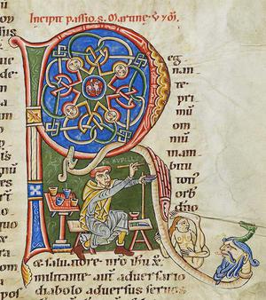 Selfportrait of Rufillus, 12th-century
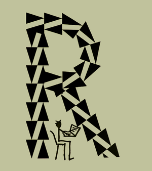 Eike Dingler working on Pattern No. 9
Type design by numbers
Since I don´t come near to have the patience these medieval monks must have had, it was very clear from the beginning that I have to find other means of drawing to achieve the desired amount of detail. So I started to set up a database consisting of parts of circles and straight lines, that build the shapes of the letters. Then a script (= a small computer programm) calculated and drew diverse patterns into the letters of the database.
Internal and External Geometry
As a result of this procedure, the outer shapes of the letters are purely gemotric, since they are all constructed of parts of circles and straight lines. The proportions refer more or less to Roman inscriptions like Capitalis Monumentalis, so there is quite some variation in the widths of letters.
All patterns of the first collection are repetitions of basic geometric shapes – squares, rectangles, rhombi and triangles — and by thus solely geometric as well.
 Geometric construction
 Geometric construction
 Geometric pattern
 Geometric pattern
Basic Collection
The first outcome is a set of contemporary ornamented caps-only display typefaces, intended to have a distinct graphic impact in large sizes. The typefaces are grouped in families, each handling a specific pattern, e.g. Pattern No. 3 is made of chessboard squares. A family might consist of several typefaces varying in weight (Bold, Regular, Light) and/or the resolution of the pattern (Coarse, Medium, Fine) — depending what fits a specific pattern best.
 Pattern No. 6 Coarse Bold
 Pattern No. 6 Fine Bold
 Pattern No. 6 Fine Light
Tips for Use
First of all size matters: Because of the amount of detail, the typefaces of the Pattern Project are no body text typefaces — they are intended to make a distinct graphic impact in large sizes (except Pattern Blank, which samples no pattern at all and thus could be used for small paragraphs of text).
The typefaces are letters and ornament at the same time. This comes with a few peculiarities you might want to consider:
As with patterns in general it is essential how far you zoom in — the typefaces might look quite different at diverse sizes. Most of them come with varying resolutions (1), to allow you more flexibility in size and graphic impression. You could also use this to keep the pattern size the same while varying the font size (2).
 1) Coarse and Fine (Pattern No. 1)
 2) Coarse and Fine (Pattern No. 3)
Also take viewing distance into account: For example Pattern No. 6 is very pointy viewed from close by but looks blurry from a distance when the eye can´t make out the single spikes any more (3).
Most of the typefaces gain a kind of transparency course to the open parts of the pattern, which allows to put text over an image without disguising to much of it (4).
 3) Pattern No. 6 Fine Light
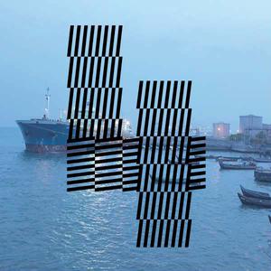 4) Pattern No. 4 Fine Bold
Pattern Type App
To live up to the conceptual possibilities of a generic type design, together with Tinkatinka I built an iOS-app that allows you to design your own patterns, set a limited amount of parameters and generate a typeface with it. Update 2024: Unfortenately we can´t offer the app any more.